Showing posts with label My House Tour. Show all posts

Wednesday, August 7, 2013

My House Tour: Savannah's Mini Makeover Details

Now that Savannah's room is finished (for now at least) let's take a look at the small changes that made a big difference in pulling this room together.

#1 - Art
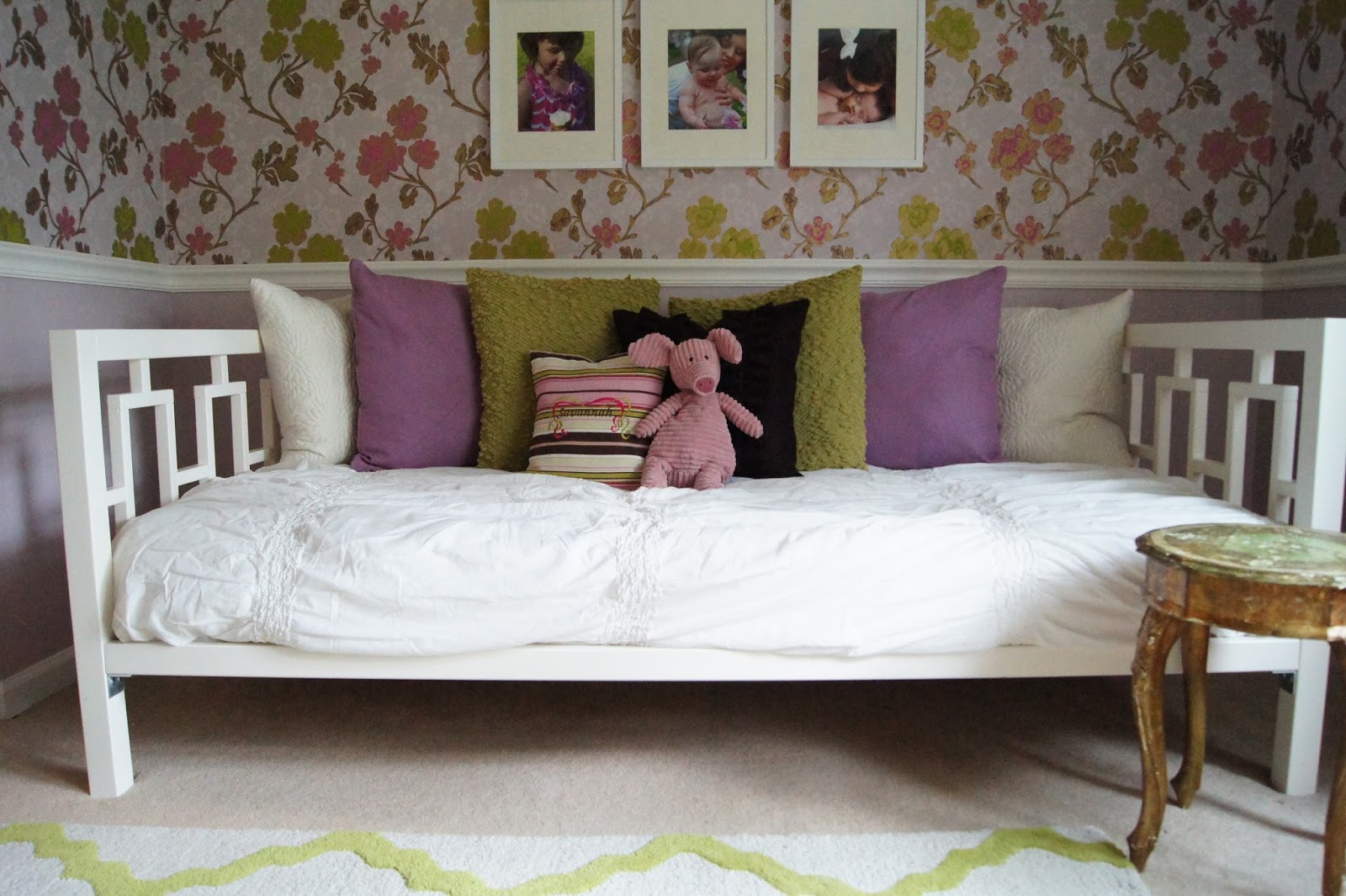
I will say that selecting art to coordinate with a heavily patterned wallpaper was a bit of a challenge.  Although you have wallpaper, you still need art.  The trick here was to frame the art with wide white mats to give the eye a place to "rest" from all of the pattern and color.

Above the bed I used Ikea's Ribba frames to display some of my favorite photos of my girl in action.  She's so vibrant and playful and these images capture her personality perfectly.


 The art on the chest was sourced from Etsy and Society 6.  The large abstract is Colors 209 by Jen Ramos.  I framed it myself by purchasing a ready made frame which I painted gold.  Since the print was not a standard size, I had the craft store cut a mat to fit.  Much cheaper that having it custom framed.  The Love print is also by Jen Ramos.  Finally, the woman with the flowers is by Susan Brown.  Savannah initially thought she looked mean, but I told her that the woman looks fierce 'cause she is rocking that crazy flower bouquet on her head!


#2 - Accessories
I found this antique mirror at a local interiors shop.  Soon after, I found it on Shop 219 via Bijou and Boheme (great designers think alike).


The lamp was originally purchased on Ebay for Madeline's nursery, but really didn't work with the wood tones of her chest.  So, in an effort to find a home for the lamp, I stuck it in Savannah's room and it worked.  I love the juxtaposition between the modern lamp and the ornate chest.


I added a dark plum and a couple of lavender pillows on the bed and ditched the chevron patterned one.  Much better.


I also switched out the rug with this one from Rugs USA.  Same pattern as the previous one, but the green is more subtle.


I'm officially crossing this room off my to do list!

Want to see more of my house?  Take the tour here.

Tuesday, August 6, 2013

My House Tour: Savannah's Room Mini Makeover Part II

If you are ever in doubt about a decorating decision, just take a photo, sit on it for a few months, revisit it, and it will become painfully obvious what is not working in your space.

This is what happened after I posted Savannah's room mini makeover back in September.  So new items were purchased and now I think her room is perfection.


Check back tomorrow for all the details!


Friday, March 29, 2013

My House Tour: Madeline's Nursery Details

Now that you've seen Madeline's nursery (click here if you missed it yesterday), let's get to all the details of this design.
 
#1 - Inspiration
Let me just say this isn't your typical nursery.  The starting point for this room was the Chinese Art Deco rug we inherited from my husband's grandmother.  This rug had been in storage for several years and the only place I could really use it was in the nursery.

 
#2 - Wall Color
I liked the pastel wall color in this Tyler Dawson room, so I chose Benjamin Moore's Rose Silk for the nursery walls.  It's a light pink that's in the same color family as the red in the rug.
 
#3 - Drapes
On a trip to World Market, I stumbled upon these green velvet drapes that pick up the green accents in the rug.  I customized them by adding some braided trim (since I don't know how to sew I just hot glued it on). 

 
The drapery rods were left over from another project.  I painted them gold with Rustoleum's Metallic Brass spray paint.
 
 
#4 - Furniture
The crib, bedding, and rocker (which was my great-great-grandfather's) were originally in Savannah's nursery and my design allowed me to re-use them in this room.  

 
The side table is from High Street Market.
 
 
I found the chest on Craigslist and it's perfect to use as a changing table.

 
For storage, I purchased Ikea Vittsjo shelves and gave them a makeover inspired by this post from Ana Antunes.


#5 - Lighting
You may remember when the Etsy gods smiled upon me and I found the most beautiful chandelier here.  It's from Etsy shop Sarah's Smiles and I couldn't be happier with the purchase and with the excellent customer service she gave me. (She even ordered me extra prismatic bulbs when I broke one and didn't know where to purchase them!) 
 
 
The original lamp I purchased for this room didn't work out, so I went back to Ebay and found this mint green vintage ceramic one that is just perfect.
 
 
#6 - Art and Accessories
The gallery wall above the crib is a mixture of high and low pieces.  The large artwork in the middle is a fine art print by Kerry Steele.  Clockwise from bottom left:  marker art by Madeline's big sis Savannah, vase of flowers art print by Catherine Nolin, pink flower photo taken by my husband when he visited Moldova, dots watercolor by me, small floral oil painting found on Etsy, pink polka dot elephant from Studio Jarrah, and green abstract photo from a National Geographic magazine.


Elephant figures, a blue and white vase, and floral pillows by Etsy shop Aurelia were selected to reinforce the chinoiserie motif of the rug.


Shelves hold books and storage bins for toys.
 
 
A tassle dresses up the vintage lamp on the chest.
 
 
I'm so glad that the nursery is finally complete!  I just hope Madeline loves it as much as I do!
 
Want to see more of my house?  Take the tour here.
 

Thursday, March 28, 2013

My House Tour: Madeline's Nursery

Finally, I can share Madeline's nursery with you!  I feel like I labored just as long with it as I did with her!  But it was a labor of love and I'm so happy with the results.
 
The "before"...
 
 
And now...


Stop by tomorrow for all of the details!
 
Want to see more of my house?  Take the tour here.


Friday, March 22, 2013

My House Tour: Kitchen Details

Remember the "before" kitchen you saw here yesterday?  Let's review:


When I first looked at this house, I saw the potential in this kitchen.  For a house built in 1969, the kitchen was large and had a good layout with lots of storage and counter space.  I also loved the built in double ovens and the large double windows over the sink.  The things I didn't love: the dark cabinetry, awful wallpaper backsplash and border, and the track lighting.
 
So let's talk about my design decisions.
 
#1 - Design Direction
You gotta work with what you've got.  The detailing on the cabinet doors had a country feel to me, so I embraced this and designed around it.  I also had the farm table from our previous home and it was the perfect size to use as an island.  The deal was sealed when I saw these inspiration kitchens
 
#2 - Painted Cabinets
The kitchen was just too dark, so one way to lighten it up and change the whole feel of the space was to paint the cabinets.  White was my first choice to help brighten the space, but I felt that painting all of the cabinets white might be a bit boring.  I also had to deal with the mismatched appliances (notice that the refrigerator is white, while the dishwasher and ovens are black).  If I painted the bottom cabinets white, the black appliances would have stuck out like a sore thumb.  That's when I decided to paint the upper cabinets white (Benjamin Moore's Vanilla Milkshake) and the lower cabinets a dark blue/gray (Benjamin Moore's Ocean Floor).  This way the upper cabinets would reflect the light and the lower cabinets would camouflage the black appliances.  Also, since I didn't have the money to replace the existing white Formica countertops, the white cabinets help tie them into the color scheme.


#3 - New Hardware
Updating cabinet hardware is one of the easiest ways to make your cabinetry look like new.  I chose pewter colored hardware because I liked how it blended with the dark blue/gray cabinets.


#4 - Glass Panel Cabinet Doors
The expanse of upper cabinets made the kitchen seem closed in, so I replaced the wooden door panels of the cabinets flanking the sink with seeded glass.  This helps open up the space a bit and allows me to show off pretty dishes.  I lined the backs of these cabinets with beadboard painted to match the lower cabinets.


#5 - Crown Molding
The molding at the top of the cabinets was a little wimpy, so we added some thicker molding to give the soffit a little more interest.


#6 - New Faucet
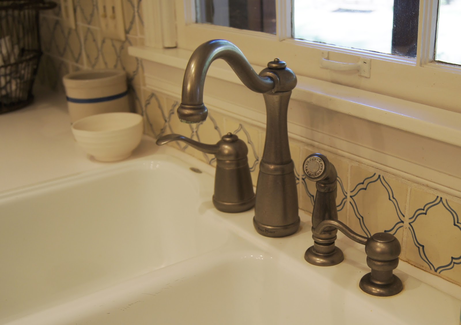
The porcelain sink was large and white, so all it needed was a new faucet to spruce it up.
 
 
#7 - New Lighting
I couldn't live with the track lighting, so I ripped it down and replaced it with a pretty chandelier.  Although the room has two large windows, they look out onto the screened in porch making the kitchen pretty dark.  So I added some recessed lights with halogen bulbs.  The trick was to place them close to the upper cabinets so that the light would bounce off the white cabinets and fill up the room.  I can see everything now!


#8 - Patterned Tile Backsplash
This is the design element that really defines the kitchen.  I wanted reclaimed tile from Chateau Domingue, but since that wasn't in my budget, I sourced some terra cotta tiles that had an old world feel.  They are handpainted, so no two are alike and each one is a little different in size.  They also have a crackle glaze on top which gives them an aged look.  You can find more info on them here.


#9 - Art and Accessories
Art and accessories are always the finishing touches that bring a space to life.  Since I didn't have any wallspace, I hung my art in an unconventional place, the middle of my windows.  Earthenware bowls, wooden utensils, cutting boards, an antique coffee grinder and an industrial stool add personality to the room.


I think this makeover shows that you don't need a major renovation to acheive some great results in your kitchen!


Thursday, March 21, 2013

My House Tour: Kitchen

My kitchen is not a newly finished project (I actually completed it in 2008) but it was finally clean long enough for me to snap some photos. Actually, the hubs interrupted my little photo session to ask if he could make a sandwich for lunch.  I answered with a silent stare so powerful that he just turned and left the room. 
Here's what we were working with:


And this is what we ended up with:


A major improvement, don't you think?

Tomorrow I'll share all of the details of my kitchen makeover.

Want to see more of my house?  Take the tour here.