
Remember the "before" kitchen you saw here yesterday? Let's review:


When I first looked at this house, I saw the potential in this kitchen. For a house built in 1969, the kitchen was large and had a good layout with lots of storage and counter space. I also loved the built in double ovens and the large double windows over the sink. The things I didn't love: the dark cabinetry, awful wallpaper backsplash and border, and the track lighting.
So let's talk about my design decisions.
#1 - Design Direction
You gotta work with what you've got. The detailing on the cabinet doors had a country feel to me, so I embraced this and designed around it. I also had the farm table from our previous home and it was the perfect size to use as an island. The deal was sealed when I saw these inspiration kitchens.
#2 - Painted Cabinets
The kitchen was just too dark, so one way to lighten it up and change the whole feel of the space was to paint the cabinets. White was my first choice to help brighten the space, but I felt that painting all of the cabinets white might be a bit boring. I also had to deal with the mismatched appliances (notice that the refrigerator is white, while the dishwasher and ovens are black). If I painted the bottom cabinets white, the black appliances would have stuck out like a sore thumb. That's when I decided to paint the upper cabinets white (Benjamin Moore's Vanilla Milkshake) and the lower cabinets a dark blue/gray (Benjamin Moore's Ocean Floor). This way the upper cabinets would reflect the light and the lower cabinets would camouflage the black appliances. Also, since I didn't have the money to replace the existing white Formica countertops, the white cabinets help tie them into the color scheme.
.jpg)
.jpg)
#3 - New Hardware
Updating cabinet hardware is one of the easiest ways to make your cabinetry look like new. I chose pewter colored hardware because I liked how it blended with the dark blue/gray cabinets.

#4 - Glass Panel Cabinet Doors
The expanse of upper cabinets made the kitchen seem closed in, so I replaced the wooden door panels of the cabinets flanking the sink with seeded glass. This helps open up the space a bit and allows me to show off pretty dishes. I lined the backs of these cabinets with beadboard painted to match the lower cabinets.


#5 - Crown Molding
The molding at the top of the cabinets was a little wimpy, so we added some thicker molding to give the soffit a little more interest.

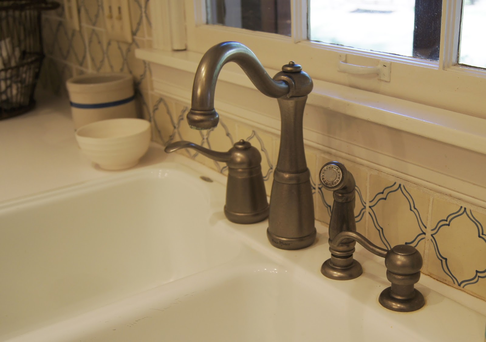
#6 - New Faucet
The porcelain sink was large and white, so all it needed was a new faucet to spruce it up.
#7 - New Lighting
I couldn't live with the track lighting, so I ripped it down and replaced it with a pretty chandelier. Although the room has two large windows, they look out onto the screened in porch making the kitchen pretty dark. So I added some recessed lights with halogen bulbs. The trick was to place them close to the upper cabinets so that the light would bounce off the white cabinets and fill up the room. I can see everything now!

#8 - Patterned Tile Backsplash
This is the design element that really defines the kitchen. I wanted reclaimed tile from Chateau Domingue, but since that wasn't in my budget, I sourced some terra cotta tiles that had an old world feel. They are handpainted, so no two are alike and each one is a little different in size. They also have a crackle glaze on top which gives them an aged look. You can find more info on them here.


#9 - Art and Accessories
Art and accessories are always the finishing touches that bring a space to life. Since I didn't have any wallspace, I hung my art in an unconventional place, the middle of my windows. Earthenware bowls, wooden utensils, cutting boards, an antique coffee grinder and an industrial stool add personality to the room.


I think this makeover shows that you don't need a major renovation to acheive some great results in your kitchen!


What a beautiful transformation! This is the perfect example of how an outdated kitchen can be updated without spending a lot of money. The paint helps to heighten the space visually by blending the soffits into the cabinetry. Love it!
ReplyDeleteThanks for the comments! I just checked out your blog. Love to see design from an architect's perspective!
Delete