Friday, September 28, 2012

I Heart Tyler

Tyler Dawson kinda rocks my world.  She designed this room, and as you may recall it is the inspiration for Madeline's nursery:
 
 
Here's some more Tyler Dawson awesomeness eye candy for you:


I love how she is just a little bit of everything: vintage, glam, modern, Victorian, bohemian, traditional.  Her rooms are always filled with color, pattern, and texture, but are still very soothing. A hard mix to master, but she pulls it off effortlessly. 
 
 If I had a million dollars, she'd be my decorator.


Thursday, September 27, 2012

Etsy Score!

I have been looking for a chandelier for Madeline's nursery for a while now.  I thought I wanted something like this (but in a different color):


These pagoda chandeliers have shown up in lots of design magazines and blogs, but good luck finding one for your home.  I checked eBay and Etsy to no avail.  Circa Who, a great little vintage shop in West Palm Beach, has some, but they are around $900 each.  Not in my budget.  I also thought maybe the pagoda chandelier with the Chinese Art Deco rug might seem like I was going for a whole Chinese themed room, which isn't the case.
So, scratch that and on to other chandelier options.
 
I thought maybe some sort of glass chandelier might work well and as I was on page 3 of my Etsy search, this little beauty appeared before my eyes, a vintage yellow glass chandelier:
 
 
The price was right and it jumped in my shopping cart in about 2 seconds.  I hit pay and am not looking back.  I am not usually such an impulse buyer, but this chandelier seems perfect.  Cross your fingers that it works (if not I will just have it re-wired) and that it looks great in the nursery!
 
This is from Etsy shop Sarah's Smiles and she has several great vintage chandeliers for sale right now.  She will also custom paint a chandelier to match your decor.  Check her shop out here.


Wednesday, September 26, 2012

Things Are Looking Up

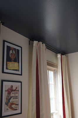
The ceiling in the hubs' office is now officially Valspar's Volcanic Ash, which is a gorgeous gray/blue color and I love it.
 
 
Some fluffing and schuzzing needs to occur before I post final pics of the whole space, but it has come a long way!
 
I have to admit, I never really thought much about ceilings before, but a little attention to detail here can really change the whole atmosphere of a room.  Here are a few more ideas:
 
Painted ceilings definitely add some drama to a space.


Patterns make a bold statement and can be achieved with paint or wallpaper.
 
via Domino
 
 
via House Beautiful
 
(Notice the wallpaper on the ceiling in the corner, it brings the whole room to life)
 
Could your ceilings use a little love?


Tuesday, September 25, 2012

Hitting the Nail on the Head

Nailhead trim has been a design trend for a while now and I think it is a classic detail that can elevate the ordinary to the extraordinary.  Here are some great ways to incorporate this detail into an interior:
 
On the Walls
 
Blogger Regina Garay of Fauxology did a great post on this and featured these images from Bilhuber and Associates:
 
Studded Foyer Wall by Bilhuber & Associates
 
Studded Living Room Wall by Bilhuber & Associates
 
Mary McDonald trimmed the walls and folding screen in this masculine bedroom with silver nailheads for a dramatic effect.
 
 
Carolina Herrera Baez's house was featured in the September issue of Elle Decor.  Jute ribbon and nailhead trim outline the moldings.


Katie Ridder didn't stop at outlining the walls, she went for an overall pattern with nailheads.


On the Furniture
 
This daybed is from a Cottage Living idea home and features nailheads arranged in a diamond pattern. 

 
This banquette has a lovely nailhead detail pattern around the seat.

 
Target has these great ottomans right now.  I picked up a couple for my living room a few days ago.


On the Stairs
 
Barry Dixon rocked some nailhead trim on these stairs.

 
Lindsay from the Sadie + Stella blog installed her own version of a stair runner trimmed with nailheads.
 
 
I am so ready to make this happen on my stairs!


Monday, September 24, 2012

My House Tour: Master Bathroom

Finally, the itsy bitsy teeny weeny master bathroom reno has crossed the finish line!  This little space has caused me lots of headaches!  If you will remember, it all started here when my husband told me he was ready to rip out the old bathroom and I had about a nanosecond to get a design plan together (not good for me because I like to take my time and think things over).  This was in January and it is now September.  Seriously?
 
I started out with these inspiration photos from a Windsor Smith room...
 
 
and this design board:
 
 
Somehow this concept never really came together and I was very frustrated.  I always think that great designers get everything right the first try (at least that's the impression I get from TV shows and magazines) but I know that in reality every designer makes mistakes, even if they don't really talk about it.  I have figured out that I learn more from my mistakes than my successes.  I think a good designer is someone who knows when something is wrong and can determine the best way to correct it. 
 
So after everything was installed, I took stock of the bathroom.  I determined that I loved the tile and fixtures in the shower, the floor tile, and the moldings that we used for the trim.  What wasn't working for me was the color scheme from the Windsor Smith photos.  It just didn't translate to my bathroom.  There was just too much white and not enough opportunities to introduce those "pops" of color.  I was too ashamed to take any photos at this point, so unfortunately I don't have any to illustrate my point. 
 
After deciding that a new color scheme was in order, I turned to my new favorite color website Design Seeds and this is what they had waiting for me:
 
 
I had already painted the vanity green, so this was a perfect palette to pull together the green vanity and the grays found in the marble vanity top, the pattern on the floor, and the grout in the shower.
 
I selected a paint color for the walls, purchased some new hand towels and art, and the whole thing finally came together. 
 
Here's a reminder of the before:


Here's the finished product:


Here are the details:

 
The white walls were painted Valspar's City Retreat (ar1416) which is a soft grayish/purple.  The lantern pendant is from Lighting Universe.
 
 
We splurged on the framless glass shower door since it is the first thing you see when you enter this teeny tiny space.  I love the curvilinear detail on the door handle.
 
 
I replaced the old vanity with a stock vanity from Southeastern Salvage.  It isn't really that much different than the old one except that it has a drawer underneath and doesn't smell old and musty!  I painted it Benjamin Moore's Nile Green and added hardware from Anthropologie.
 
 
The vanity also got a marble top and a polished chrome faucet from Lowe's.
 
 
The shower walls are American Olean white subway tile with dark gray grout.  The shower fixtures are Delta, all from Lowe's. 
 
 
The shower floors are American Olean hexagon mosaic tile with dark gray grout, again from Lowe's.


The bathroom floor is encaustic cement tile from Villa Lagoon Tiles.
 
Here are a few shots of the finishing touches:


This room makes me so happy!